Optimizing Your Unsubscribe Process

There are a number of way that you can handle unsubscribe requests.
Some of the more common ones include:
- One click unsubscribe: A single link in your message that automatically removes the subscriber from your list(s)
- Manage subscriptions page: A page that let’s subscribers opt out, change frequency, change types of emails, etc.
- Unsubscribe page: Like an optin page, but allows them to unsubscribe instead by entering their email address
- Email unsubscribe: Send in an email to unsubscribe (or send request via mail or fax)
Let's take a minute to explore some issues related to the unsubscribe process...
First Things First: Don’t play games with the unsubscribe process.
There are enough people that use the “spam” button as their standard unsubscribe link as it is. You don’t want to encourage subscribers to get frustrated and click the spam button by giving them no other alternative.
You should always be looking for ways to make it as EASY as possible for subscribers to opt-out of your emails and to get off your list if they no longer want to receive your emails.
If you make them jump through hoops - or require them to take more than a single step - you’re going to increase your spam complaints, plain and simple.
That’s not to suggest you should have a blinking button encouraging them to opt-out! But it does mean that you shouldn’t make it near impossible to locate your unsubscribe link with tactics like:
-
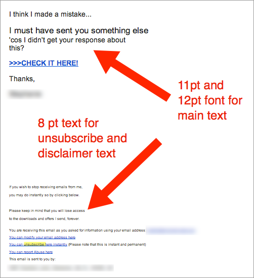
Making the unsubscribe link so small that they can hardly find it.
Making the unsubscribe text super tiny and hard to find INCREASES spam complaints.
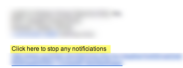
- Using uncommon words or phrases like, “to stop receiving advertising and other promotional emails from XXX.com®, click here” or “Adjust your settings here” and intentional misspellings.
Not using words like “UNSUBSCRIBE” clearly in the unsubscribe link makes it harder to find the link when scrolling through an email or searching for typical keywords.
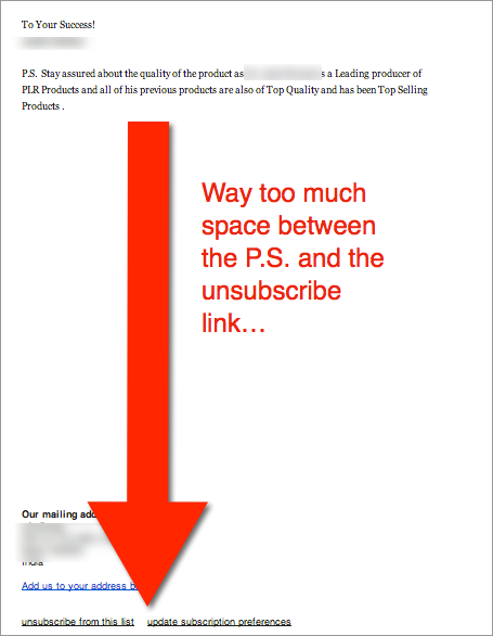
- Hitting the enter key ~20+ times to push the unsubscribe link way past any natural scrolling.
Pushing the unsubscribe link way down doesn’t do anyone any favors. If your subscribers can’t find your link, then they’re going to hit the spam button (which they CAN easily find!)
There are better ways to use the Unsubscribe
As with everything, there is a balance to strike. You don’t want to make it near impossible for someone to unsubscribe from your list, but you also don’t want to make it easy to mistake as part of click sequence either.
For example, if you have accustomed your subscribers to click the first link the message, you may not want to put your unsubscribe link at the top of the page. Likewise, if you always include a P.S. with a call to action, you may not want to put your unsubscribe link right next to the P.S.
People are scanning their emails quickly and often just click links based on placement!
What’s the Right Answer?
I’ll give you the answer that my attorney friend always gives me (which does drive me nuts, by the way)… “It Depends”.
It depends on your marketing model. It depends on your relationship with your list. It depends on the types of email marketing messages you are sending. And it depends on the frequency of email messages.
The truth is, there’s a certain percentage of your subscribers who simply don’t want to get ALL of your email, but may still want to get newsletters or “weekly roundups”, for instance.
Earlier this week, we were talking with one of our clients about the opt out process and they shared with us their “Manage Subscriptions” page, which is very well done. (And which they have agreed to let us share).
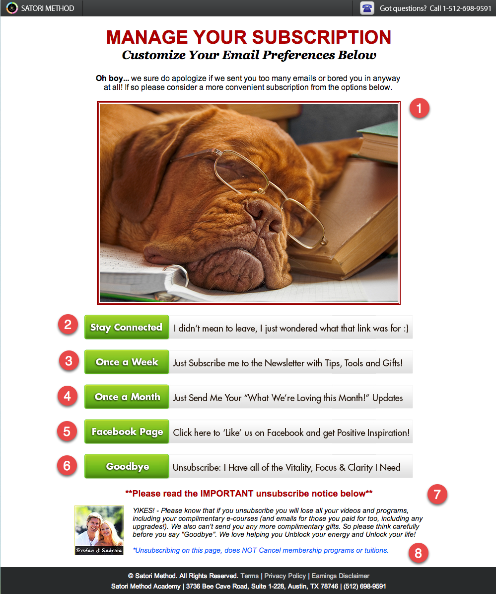
When someone clicks the unsubscribe link at the bottom of any of their email marketing messages, they come to this “Manage Subscriptions” page:
Here are a few things worth pointing out:
- Humor… The “bored” dog adds a bit of entertainment and makes you stop for a moment to see what this is all about. Plus, if you follow them at all on social media, you’d know that they make - and comment on - quite a few posts animal related, dogs, in particular. So, while it IS humorous, it also connects to their social conversations.
- Stay on the list. People often click links and realize after the fact that they’ve made a mistake. This let’s them confirm they want to unsubscribe and let’s them choose to “stay connected”
- Drop emails down to once per week. This is great if you a weekly email newsletter or round up from the content that you sent out during the past week.
- Drop emails down to once per month. Consider sending out your top 5 articles and top 5 resources once per month. This allows you to keep people engaged and gives them the opportunity to raise their hand again when a particular topic is of interest to them.
- Social Media. Some people simply choose to interact on Social Media. Give them the option to connect with you on Facebook and then you can target them specifically through your pages for special offers, promotions and product launches. You never know when they’ll circle back around to your list.
- Opt-Out. This is the global opt out. When they click on this, they’re unsubscribed from all the lists and won’t receive anymore email unless, of course, they opt back in in the future.
- What to expect when they DO unsubscribe
- And that this is not going to unsubscribe them from paid subscriptions. This is very important if you have any kind of continuity program…
NOTE: When you select one of the options to “stick around”, they give you an extra bonus as a reward!
A creative example of an opt out confirmation page is from Groupon.
This example is for a straight unsubscribe rather than a manage subscriptions page.
They have since changed it, but you can see what it used to be here:
Groupon also had an optin to re-subscribe from the page as well (I know a few people who actually DID unsubscribe only to be entertained enough by this video that they resubscribed!)
We’d love to see your creative unsubscribe or manage subscription pages… So, if you’ve come across one (or have one of your own that you’d like to share), send it along and we’ll add it to the showcase for an upcoming series that we’re doing.
Attention Readers, Publishers, Editors, Bloggers, and Marketers: You may republish or syndicate this article without any charge. The only thing I ask is that you keep the newsletter article or blog post exactly as it was written and formatted, with no changes. You must also include full publication attribution and back links as indicated.
This information has been provided by http://www.EmailDelivered.com and written by Heather Seitz. Don’t forget to sign up for the EmailDelivered Pulse newsletter for articles, tips, and recommended resources related to email marketing and email deliverability.
Related posts:
Revealed:
How to Get Your Emails to the Inbox
If you want to get more of your emails to the inbox, you need to know the secrets that the Email Service Providers AREN’T willing to tell you. For a limited time, I’m sharing some select tips that top Internet Marketers know... for FREE.
Here’s what you’ll get right now...
- The How to Guide for getting your emails back to the inbox.
- How to find (and improve) your email “reputation” (how the ISPs see you).
- 5 Email KILLERS that your email service provider is purposely hiding from you.


No comments yet.